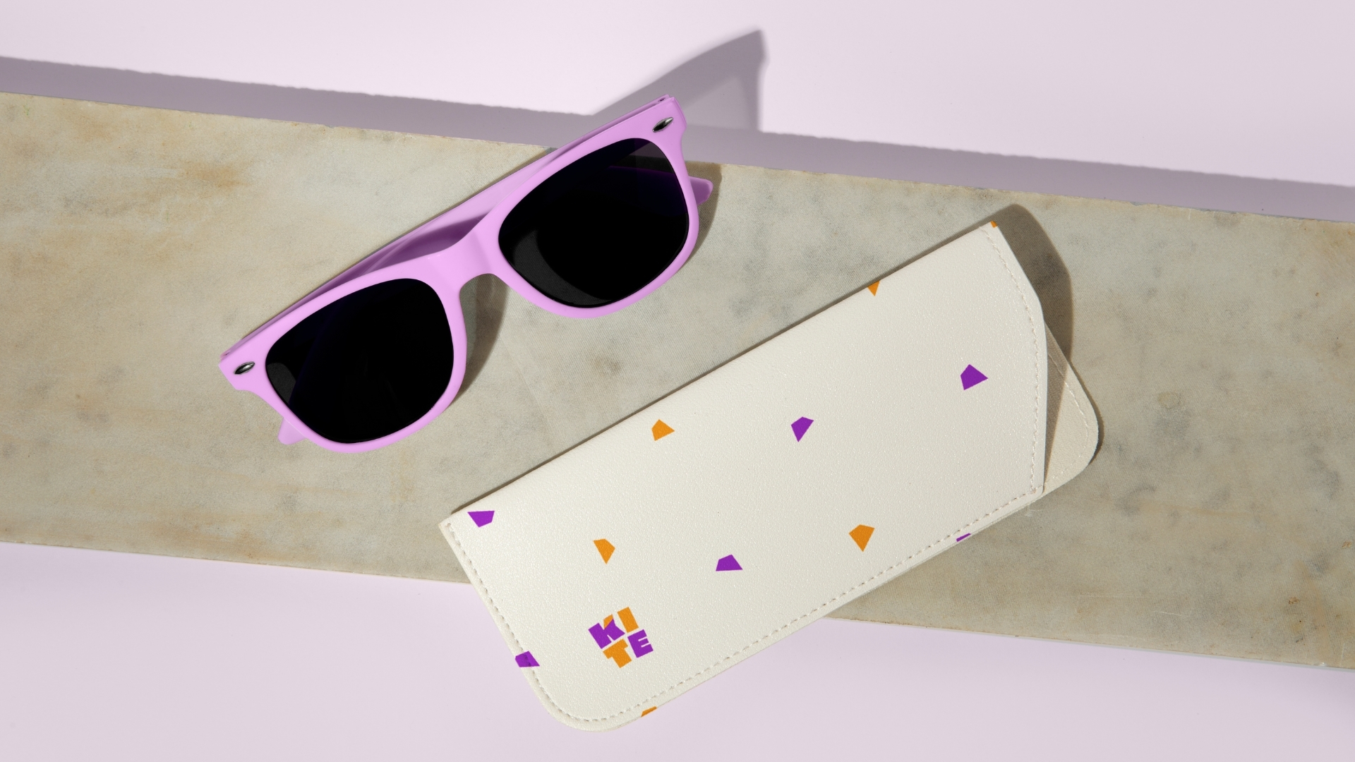
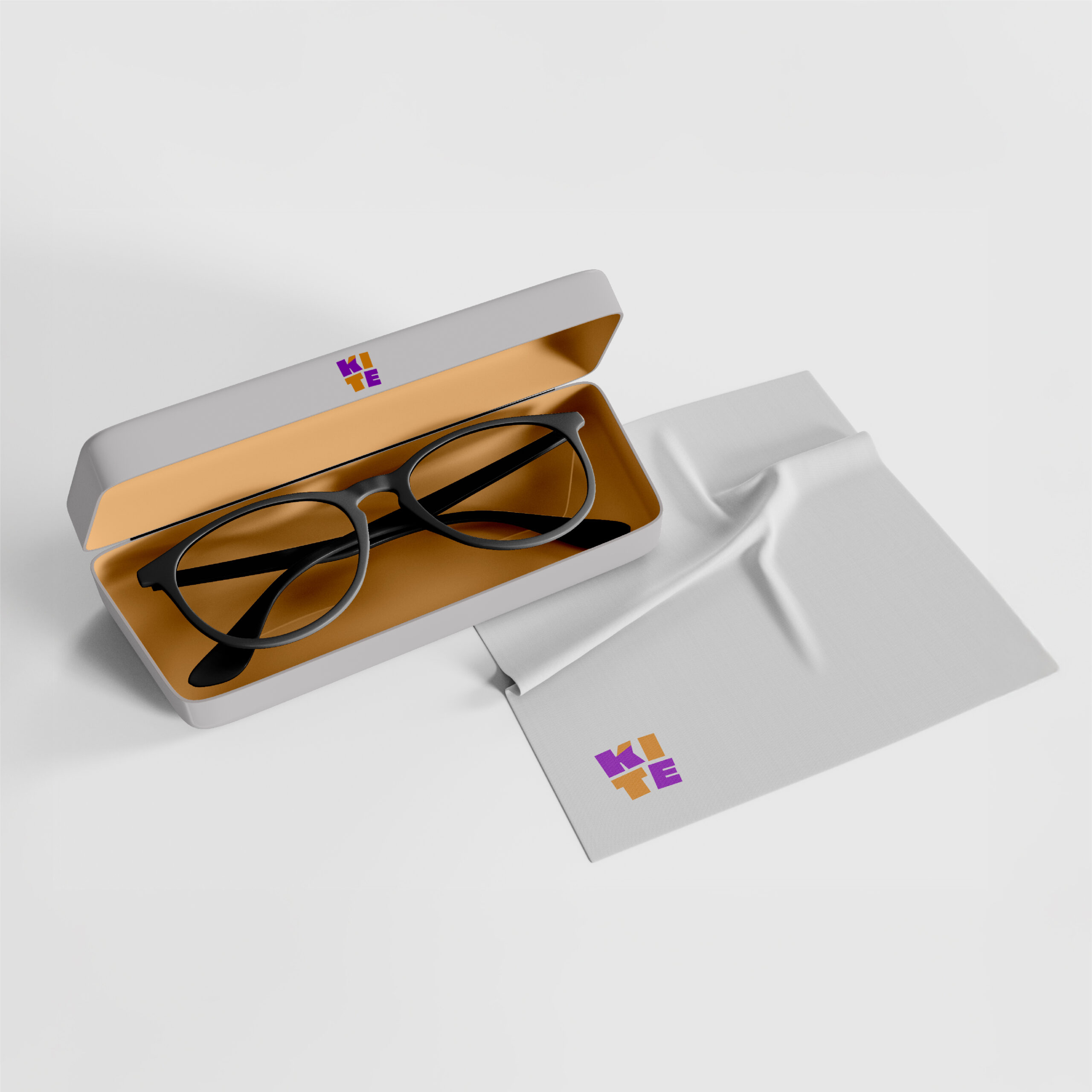
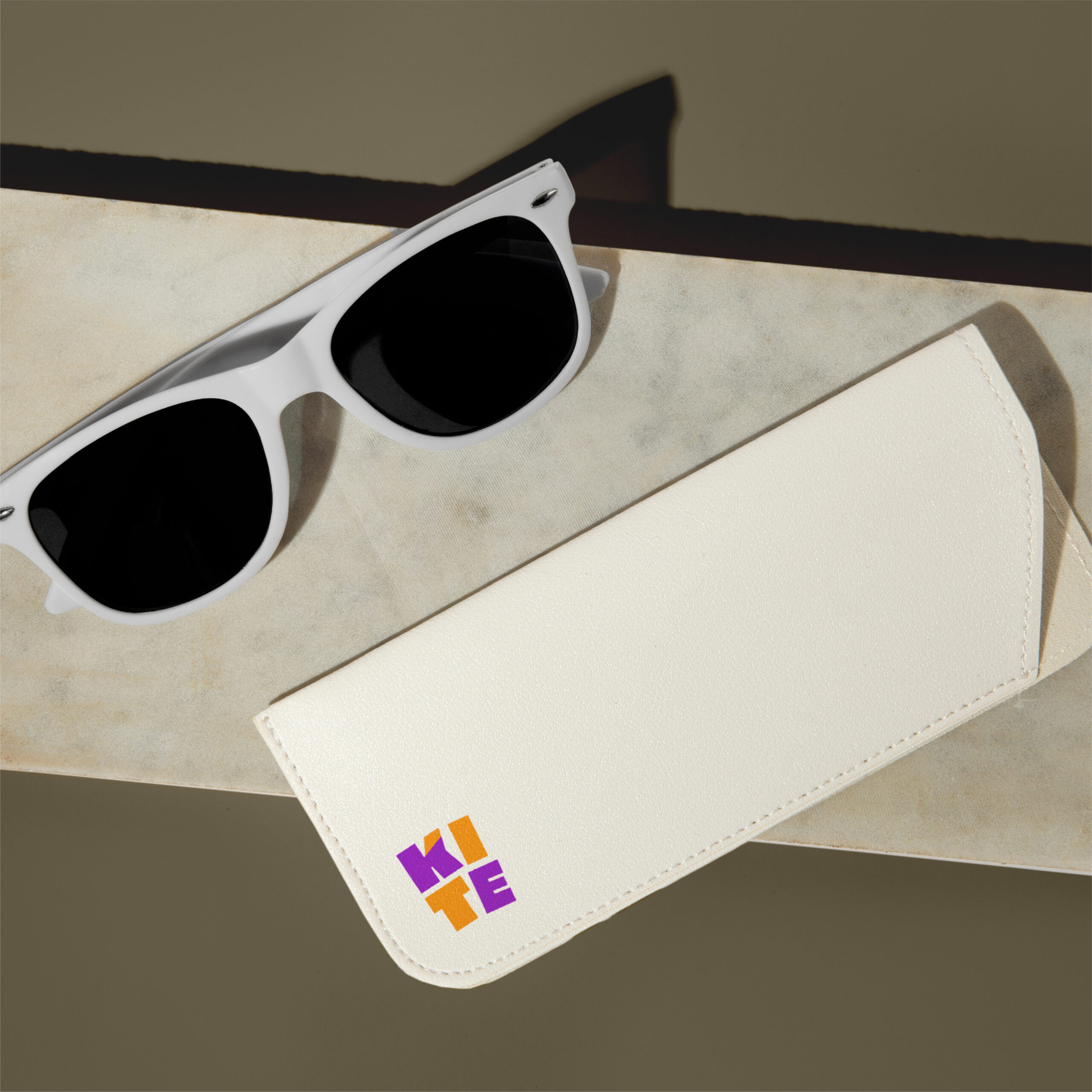
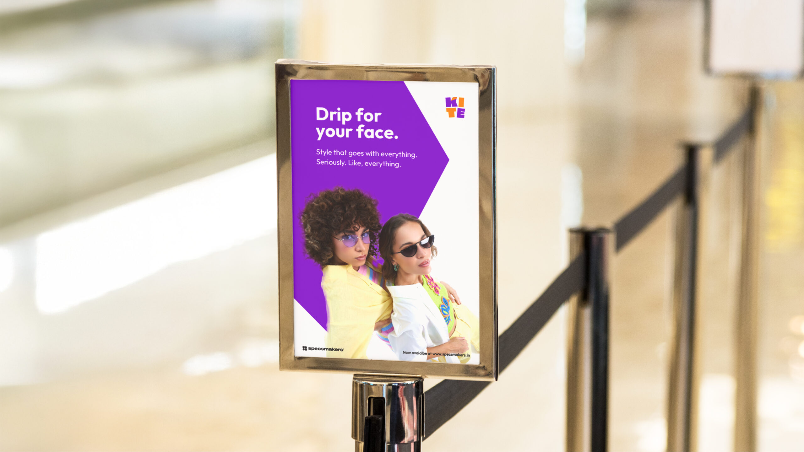
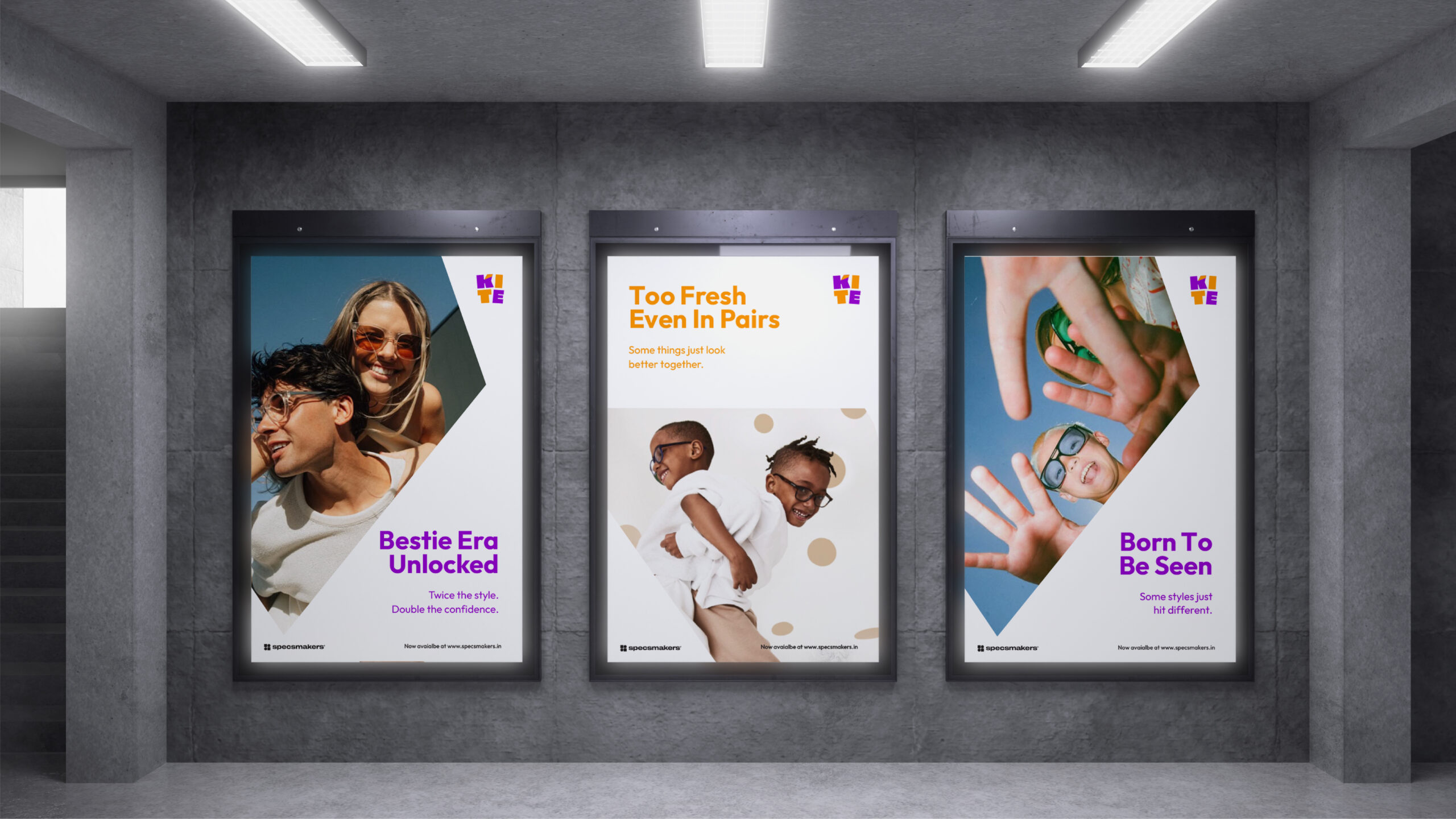
Kite’s brand identity brings bold colour and confident energy to kids’ eyewear, balancing playful expression with comfort and parental trust.
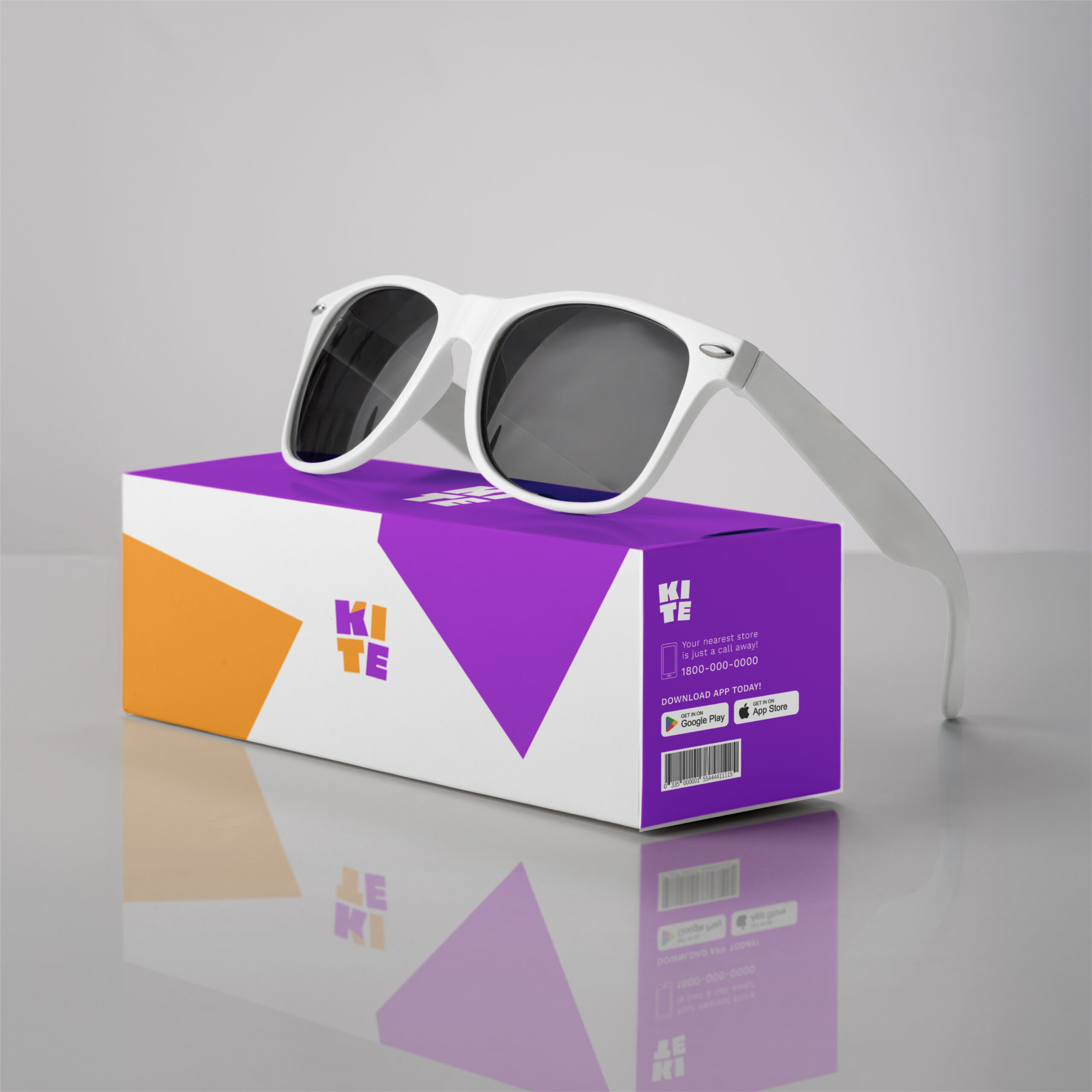
Kite’s visual identity combines bold typography, vibrant colour and dynamic layouts to create eyewear packaging and communication that feels confident, expressive and relatable for kids, teens and parents alike.
The Result
The result is a bright, confident eyewear brand that connects with young personalities while remaining trustworthy, wearable and ready for everyday use.