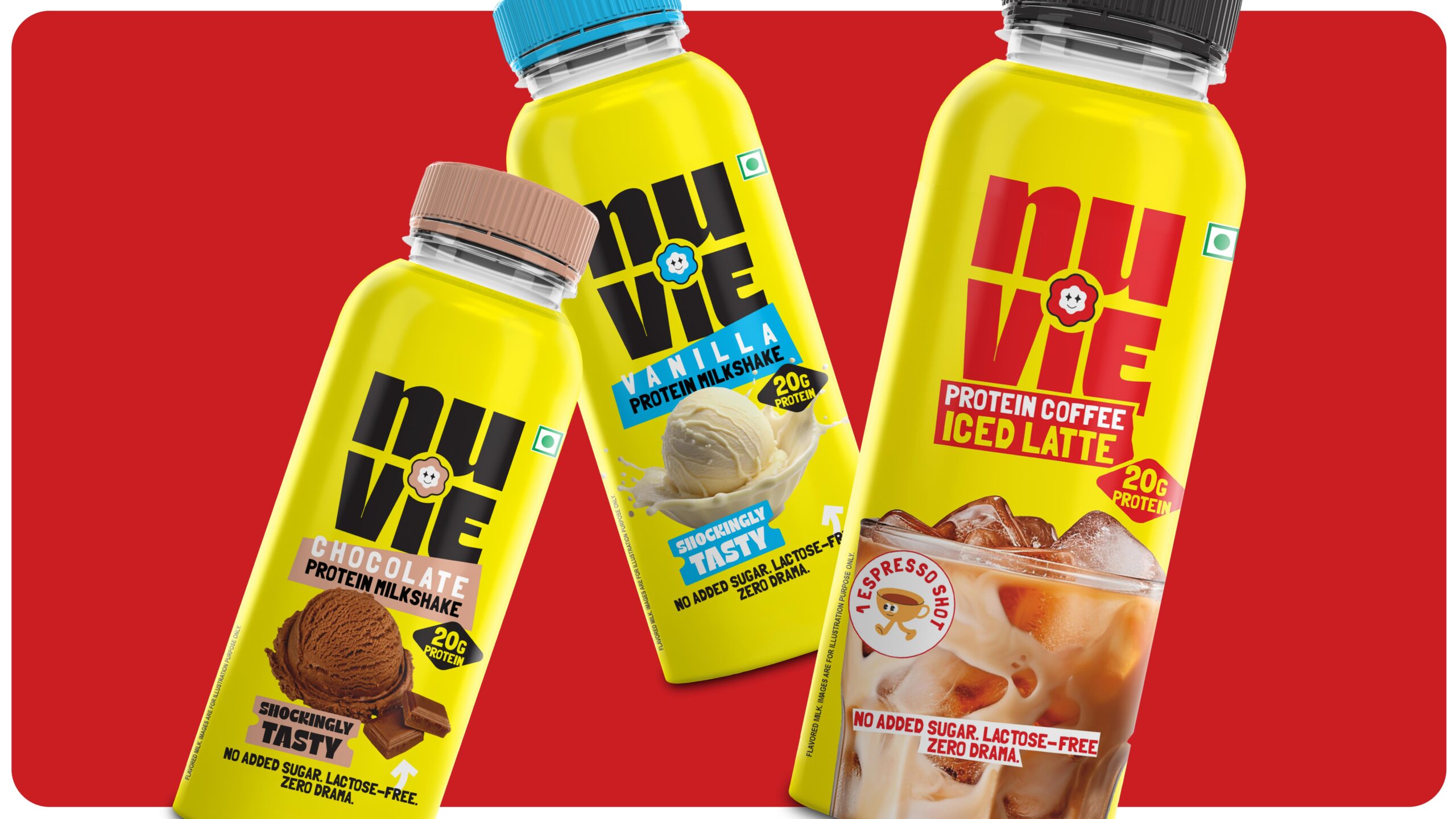
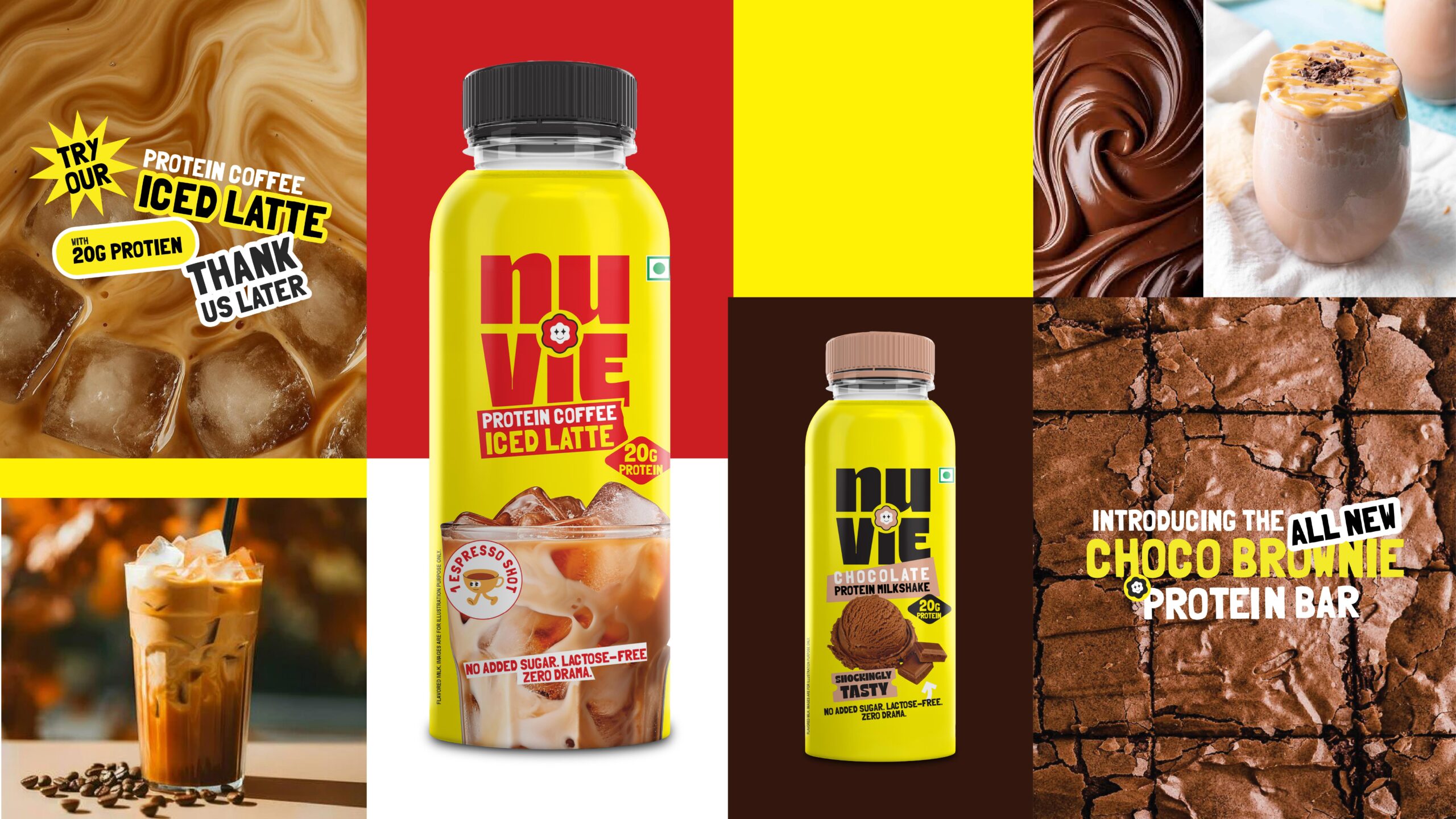
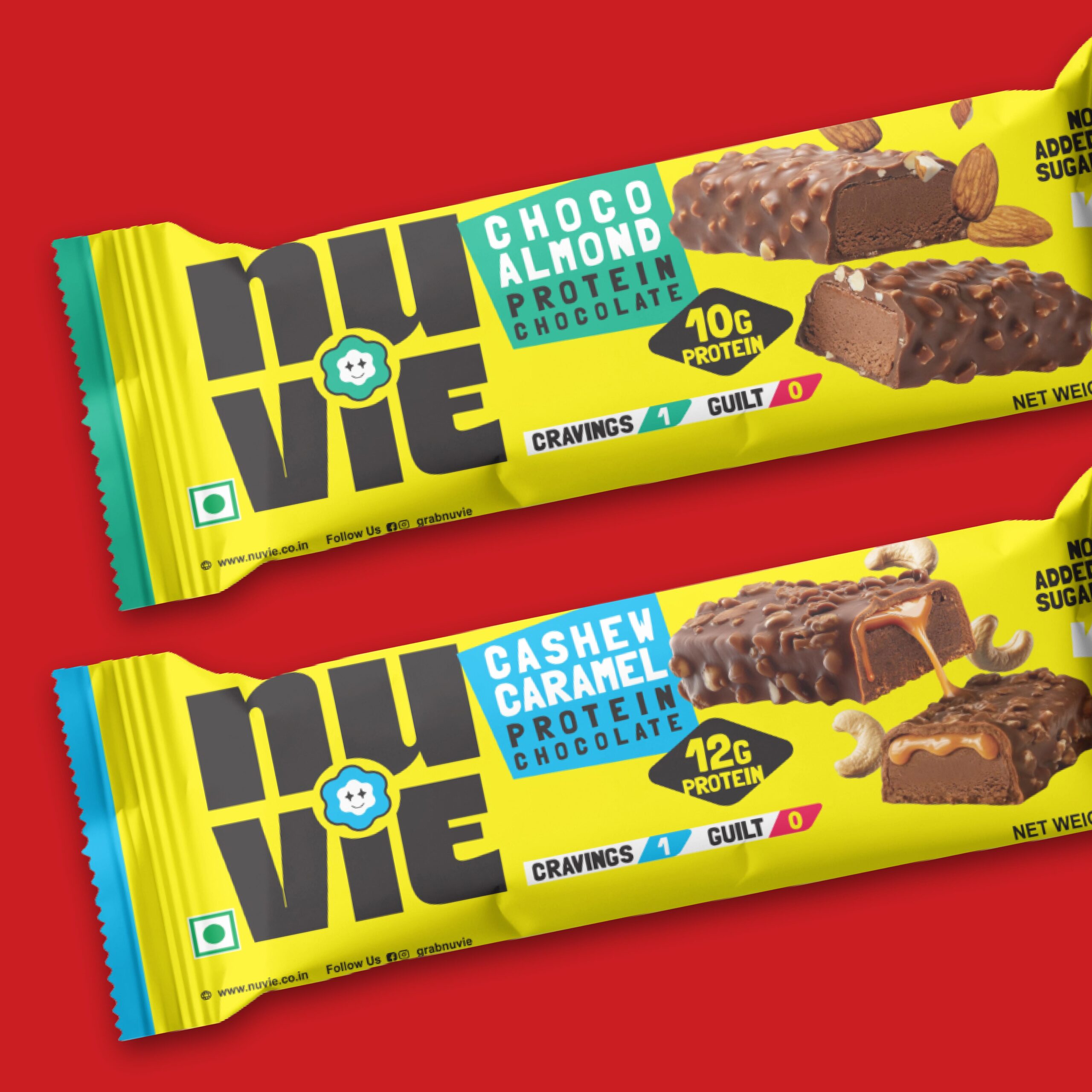
Clean, single-colour protein brand offering bars, shakes, and bestselling protein coffee designed for bold Gen Z lifestyle nutrition appeal.
In a category flooded with loud claims, hyper-masculine aesthetics, and rainbow-coded flavours, this fast-growing protein nutrition brand approached us to rethink how it shows up in culture. With a portfolio spanning protein bars, protein shakes, and a breakout best-seller – protein coffee, the brand wanted to move beyond functional fitness and become a lifestyle choice for India’s Gen Z consumers.
Our challenge: create a distinctive brand and packaging system that cuts through clutter while building recall across formats and shelves.
Through category audits, consumer conversations, and shelf studies, we uncovered a key truth: Gen Z doesn’t want to decode packaging. They want brands that feel iconic at a glance. Instead of competing through more colours, we identified an opportunity to win through extreme simplicity and bold recognisability.
We moved away from the category’s rainbow packaging philosophy and built a single-colour brand world – a deliberate move to create instant recall, visual authority through a maximalist design philosophy and indulgent flavour cues aligned with brand positioning. This created a packaging system that feels confident, modern, and unmistakably ownable.
The Result
We delivered a stronger shelf differentiation in a crowded category with a cohesive design language across product categories. This also led to an elevated perception from “fitness supplement” to lifestyle nutrition brand having a distinctive visual asset the brand can own long term.